Pages

Sunday, February 26, 2012

Garden Diary: Borrowing Saint-Gaudens' Solution

Saint-Gaudens is certainly among America's greatest sculptors. His house and studio, called Aspet, in Cornish, New Hampshire, is a National Historic Site now operated by the National Park Service. The formal garden he created on the private side of his house, though not well maintained, as one would expect at a historic site operated by the NPS, is a rather famous example of a unique solution to the problem of creating perspective where no vanishing point exists.


Two sets of stairs create a central axis in this simple garden, directing the eye to what was then the blank side of the house. Saint-Gaudens' solution was to create a pergola feature that imitates a door into the house, at least from a distance. Up close it's a simple arch with lattice behind and a sculpture of Dionysus.


I think I'll use the same concept, but instead of the small pergola, I'd construct a shallow shadow box affair, probably painted the same slate color as the garden wall behind, about five or six feet high, and fronted by trellis mounted several inches out from the box, to create a sense of depth, and painted a dark green. It would be positioned approximately where I'm standing in the photo below.


Vines will grow on the trellis (not sure what yet) and  some central feature will attract the eye to a single focal point. I have an old ceramic mask of Bacchus glazed in white, bought on our first visit to Florence over 25 years ago. I might use that, though it may be overly "mannered" for my garden.


I'll have to wait and see how it all comes together. A stone architectural artifact may work better.

Though I don't have Saint-Gaudens' embankments to give a sense of rising height, I may also add landscape timbers to create a terraced effect, as shown in this sketch Peter Holt was kind enough to send me.


Below it all will be the leaky "lotus" pool (perhaps) used as a planter, at ground level.

If I could draw, I'd put a drawing here.


Thursday, February 23, 2012

Garden Diary: Slate

Today was another sunny, extraordinarily warm day in this month we expect to bring us nothing but dreary skies, ice and snow. I spent some time in the plantless, exposed garden site looking at colors. What I've realized after trying eight colors is that one dark color--called "Slate" by Behr--is fairly ubiquitous in the surrounding environment. It's almost the same color as the expanse of windows and doors opening onto the garden, and it's present all around, in the iron work on numerous houses, railings, window frames, telephone and cable lines, telephone poles, and most prominently, in the dark shadows cast by the bright overhead sun.

I've found my color.


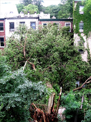
You can see it in the dark windows against the white wall below, in the wires and cables stretching to the backs of the houses, in the shadows and the ironwork balcony on the right. "Slate" is no. 376, second from the right on the wall.


I had a strong preference for the gray (518) earlier in this process. That color is much less blue than it appears in the photo, tending toward taupe. But I think the Slate resonates with the environment, and I do think it will work well with the plants, especially after some green vines attach themselves to the wall.

Below you can also see how the darker color takes on a grayness when sunlight strikes it at a certain angle. That grayish reflective surface, changing with the light, will make for a satisfying background to the plants, and add richness and depth.


I bought the Slate stain this afternoon and expect the contractor to have the walls painted soon, though the forecast for rain tomorrow may delay that. I'm hoping the warm weather continues for a while so this can be finished.

For what it's worth, below are the three new colors I tried earlier this week:  Forest from Behr, Jasper and Charleston Green from Sherwin Williams. Forest looks very olive, much more so than you can see in the photo. Both Jasper and Charleston Green appear to have a lot of blue in the photo, but they don't.

Without first trying these colors, I don't think I'd have been ready to choose Slate. But when I looked at the array of colors this morning, and at the surroundings (not lovely but with their own color palette), the decision was immediate.


On another subject, but related because it does illustrate how important shadow will be in this little garden, I'm thinking of using this old, cracked, round fountain as a planter. I originally thought it would be inappropriate, but it may work if planted with mosses, small ferns, and other things. Most of it will disappear. I may need to pump a trickle of water to keep it moist. Just an idea. We'll see ...


By the way, that motion-activated security light over the center of the doorway is coming down. It's supposed to be off to the side, as invisible as possible.


And looking away from the house, the back of the garden badly needs a point of focus, a feature to draw the eye. Something on axis and with height. I have an idea I'm working on. Saint-Gaudens used a similar concept for a focal point in his garden in Cornish, New Hampshire (not that I'm claiming his robe, but one can imitate a good idea when it comes freely, no?).

Below, where I'm standing, not a doorway, but a portal of sorts.


Saturday, February 18, 2012

Garden Diary: Testing Fence Colors for the Brooklyn Garden

Looking, looking, looking for the right color for the fence ... Not there yet.


Five colors so far, from left to right, Harbor Gray, Heritage Blue (it looked gray on the color swatch), Pewter, Slate, all Behr colors from Home Depot. The last a color I saw on Susan Cohan's blog, Sherwin Williams' Bohemian Black with, in Susan's words, "a decidely plum cast."


Harbor Gray ... too light. Heritage Blue ... too blue.


Pewter ... gets a maybe. Slate ... also a maybe. I really think I'd like to see something closer to my original idea of Charleston Green, though Les disapproves.


Slate again ... and Bohemian Black on the right. The plum cast is much more clearly evident in sunlight ... a good color for the right application, but I think not mine.

[After publishing this post, I've come back to make one additional comment. The black on the right above is the same black shown on the left below. The angle of light (the sun is off to the left behind me) makes them look like different colors ... much lighter below than above.]


So this weekend I'm getting Benjamin Moore's Salamander, a black green with a touch of olive, Behr's Forest (probably too green, though quite dark), and Sherwin Williams Charleston Green. It was interesting to find that, though Sherwin Williams no longer offers Charleston Green, the mix remains in their database of historic colors and can be made up at will.
I really think I'd like the color in the so-far anonymous garden image below, but I may never get it.


But is perfection necessary?

Sunday, February 12, 2012

Garden at Federal Twist - 2011 Overview

Overview of 2011 at the Garden at Federal Twist, starting with the blank canvas after burning and cutting in March, to the height of growth in late June and July, the terrible early snow and ice storm in late September that squashed the garden flat (very unusual), to the colorful, abstract decline into fall and winter. Click on the photo.


Tuesday, February 07, 2012

Garden Diary: Adapting to reality


I'm pleased with the off-center symmetry of the evolving garden, and the interplay of the rectangles, quite pleased, actually. The axis runs off the center of the glass doors (that gold hardware has to go!), and will terminate at the back of the garden, in some way I have yet to determine--though I'm still haunted by Ross Hamilton's Italian ruin idea. (That piece of fence in front of the pool is construction detritus.)

I wish the pool were only 18 inches deep, as well as a foot shorter and two feet narrower, but I have to adapt to this oversized 4- by 9-foot monster (maybe I could make a hot tub ... just kidding). This pool poses a tripping hazard and could be dangerous, so I'll need to give attention to perimeter protection. I'm not sure how I'll do that, but part of the solution will be to add bluestone coping all around as a visual cue. Possibly some planting, pots on the coping, lighting at night ...


First change dictated by the unexpected spatial relationships? I'll have four trees, not six, in the graveled area, near the four corners. The long narrow pool I had planned would have allowed space for a third set of trees in the middle of the garden. But trees around this pool, as built, might narrow the passage sufficiently to cause visitors to walk unconsciously toward the pool, and possible injury. I also left 10 feet of open garden planting area in the back, substantially shortening the paved length of the garden. Best keep this area as open as possible, and direct foot traffic with square stepping stones or judiciously placed planting. Think boxwood and bergenia for starters.

I'm not displeased with this. I can work with it. And should I want koi (I don't), I can have them.

The next image demonstrates why I need a tree canopy, and fast. This is a very exposed site now that the 80-foot mulberry is gone (thanks to hurricane Irene).


I will need screening on both the left and right of the extension to break up the mass of the structure and to provide some privacy to anyone sitting in the bluestone area just outside the glass doors.

I think you can see here that multistemmed trunks, roughly in the four corners of the gravel rectangle, would be almost perfect, so I'm taking Michael's and Les' suggestions for Stewartia or Chionanthus retusus seriously. I'm also open to Billy Martin's Medlars, which I think would be a truly unique solution. Of course, my old favorite Sunburst honey locust (Peter Holt likes them too) remains if all else fails.


You can make out the view into the garden through the doors below even though they remain covered in protective plastic wrapping.


The buildings beyond, again, give you ample evidence of the need for quick cover (instant tree canopy). While this is a historic district, and the fronts of most houses are beautifully maintained with their original brownstone detail from the latter half of the nineteenth century, no one pays much attention to the backs!


And here an even better view of the back facades to be obscured across the block ...


A view from above, though much of the garden is cut off by the parapet of the extension roof ... Useful visual information for those not familiar with the structure of Brooklyn back yards (this is where the privy was when most of these houses were built; plumbing was a rarity in the early days). By the way, Spike Lee grew up in one of the houses off to the right.


The bluestone and gravel look quite blue late in the afternoon shadows, but the actual color is gray. I'm paying attention to these details in selecting the color to stain the fence.


A more true impression of the color of the gravel ... at least until we get a heavy rain.


The budget for all of this? Maddeningly, less than the cost of removing the fallen 80-foot mulberry!

Friday, February 03, 2012

Garden Diary: Trees for my small garden

Michael of The Gardener's Eye suggested I take a look at Luciano Giubbilei's use of limbed up Parrotia perscica in his 2011 Chelsea Flower Show garden, which won a Gold award. These twisting trunks (the image is from Giubbilei's web site) read like a masterful calligraphy, and lend a sense of repose, like motion caught out of time. Giubbilei talks about the garden in this BBC interview.


I really love these, but I can't wait 40 years at my age, and I certainly can't afford such carefully grown, old trees for my Brooklyn garden.

I've considered alternatives to the now final choice of Sunburst honey locust (Gleditsia triacanthos 'Sunburst'). The native grey birch (Betula populifolia), used extensively on the High Line, was an early contender.

It's a small native tree, and its white bark would look good with a high trimmed canopy. Here it is in winter.


As used on the High Line, it's very effective in creating secluded spaces and a naturalistic feeling in an otherwise very exposed and open environment.


It's trunk is attractive and the white color would provide a dramatic contrast in a shady garden (and mine will become more shady year by year).


Even if I trim the trunks high, the clumping form of the birch may take far too much space. And the birches can't match the locusts for stunning color.

Ultimately it's a matter of personal choice, and some chance, I suppose.

Thursday, February 02, 2012

Garden Diary: Color ideas for fencing

I've found limited useful information in my Google photo searches, not nearly so much help as I got from the many comments on my last post on garden fence color.

Here is one dark color that works well with green. Of course, this is a wooded setting without the unsightly buildingscape I have surrounding my new garden. Will a color like this highlight the very view I want to de-emphasize? I like this effect, though I'd prefer a color with more gray/charcoal and less green. This is a rather dark color, but it has a surprisingly reflective surface, which increases the contrast with the dark green foliage of the plants.


Here's another similar color, but with more green. I prefer something closer to charcoal or gray.


Now this appears to be a black fence with a very flat, reflective surface. I definitely don't want this.


This putty gray color isn't bad. Not my preference right now, but something in this family may be an option. It would blend well with the surrounding building colors, and might make them less obvious.


I think the next step is to get samples and paint them on for an in situ test.

I've started a garden fence board on Pinterest (link on right side of this blog). If you have other examples, please let me know.

LinkWithin

Related Posts with Thumbnails